Susie Monday

Artist, maker, teacher, author, head cook and bottlewasher.

Sign up here for monthly newsletters from me!

The art I make is the result of a life-long love of pattern, texture and color. How I teach is a skill honed by experience (I started teaching creative arts to younger kids when I was 12). After earning a B.A. in Studio Arts from Trinity University, I helped lead an internationally recognized educational foundation, designed curriculum exhibits for schools and other institutions, wrote and edited for a major daily newspaper, opened the San Antonio Children's Museum and then, a dozen years ago, took the scary but essential (for me) leap to become a fulltime artist and art teacher.

About This Blog

This weblog is about the maker's life. The teacher's path. The stitching and dyeing and printing of the craft of art cloth and art quilt. The stumbling around and the soaring, the way the words and the pictures come together. Poetry on the page and in the piecing of bright scraps together. The inner work and the outer journeys to and from. Practicalities and flights of fancy and fearful grandeur, trivial pursuits and tactile amusements. Expect new postings two or three times a week, unless you hear otherwise. 

To reach me, leave a comment after a post, OR email me at susiemonday@gmail.com 


To receive a notice of new posts in your email, scroll down this column to the end of the page and subscribe via FEEDBLITZ or add this blog to your own subscription service. You can search the blog with any phrase or word, by typing it into the seach window below:

Subscribe .. Or Write Me!

Subscribe to a email feed of this blog by filling in your email address in this box. Your email will not be sold or shared with others.


Preview | Powered by FeedBlitz


This form does not yet contain any fields.
    Login

    Entries in technology (17)

    Friday
    Mar232012

    More Fun on Mixel

    OK admission. I am addicted to Mixel now. It's totally taken up all my FB time (thank you). And the chitchat is minimal. Mostly you just make stuff sort of together. Now the warning. Anything you upload becomes public property. I am mostly just adding a few detail images and nonart snapshots to the process. But I love the cropping and layering soooomuch. And I am printing some of these on fabric, too.

    I have figured out how to use the software to  make collages (fun-- crop with your finger or a sylus from any of your own photos or web images or images other Mixel users have contributed) without making images public or getting involved in the public arena of this software. You do have to have an account (no longer only possible with a FB account) but you do not have to post to "the world." After making a Mixel, just go to the upper left corner and take a photo -- saves to your ipad. Then DELETE the image. 


    Sunday
    Mar182012

    Designing with Type Shapes 

    As part of my online Joggles course (get the full story here) I'll be doing an occassional post here that my online students can use for further ideas; maybe those of you reading along can pick up a tip or two as well.

    I've been pondering collage design with type and "found letters," those cut from magazines and newspaper or even spit out in differing sizes from your computer font library. Putting them together quickly, then arranging, rearranging and copying out bits and pieces in differing sizes is how I like to work on these random text collages -- I am not necessarily going for a literal message, more just the feel of type as shape and form and texture. But there is also an interesting challenge in using the letters of a meaningful or intriguing word that you might want to have as a kind of hidden message in a piece.

    For example, this piece, while primarily a strong and bold composition, with text that pops out -- mas (Spanish for more) and LIFE from the classic magazine title -- also includes the "hidden message" "music." Each horizontal pieced  band of fabric is a repetition of each letter M, U, S, I, C in order. 
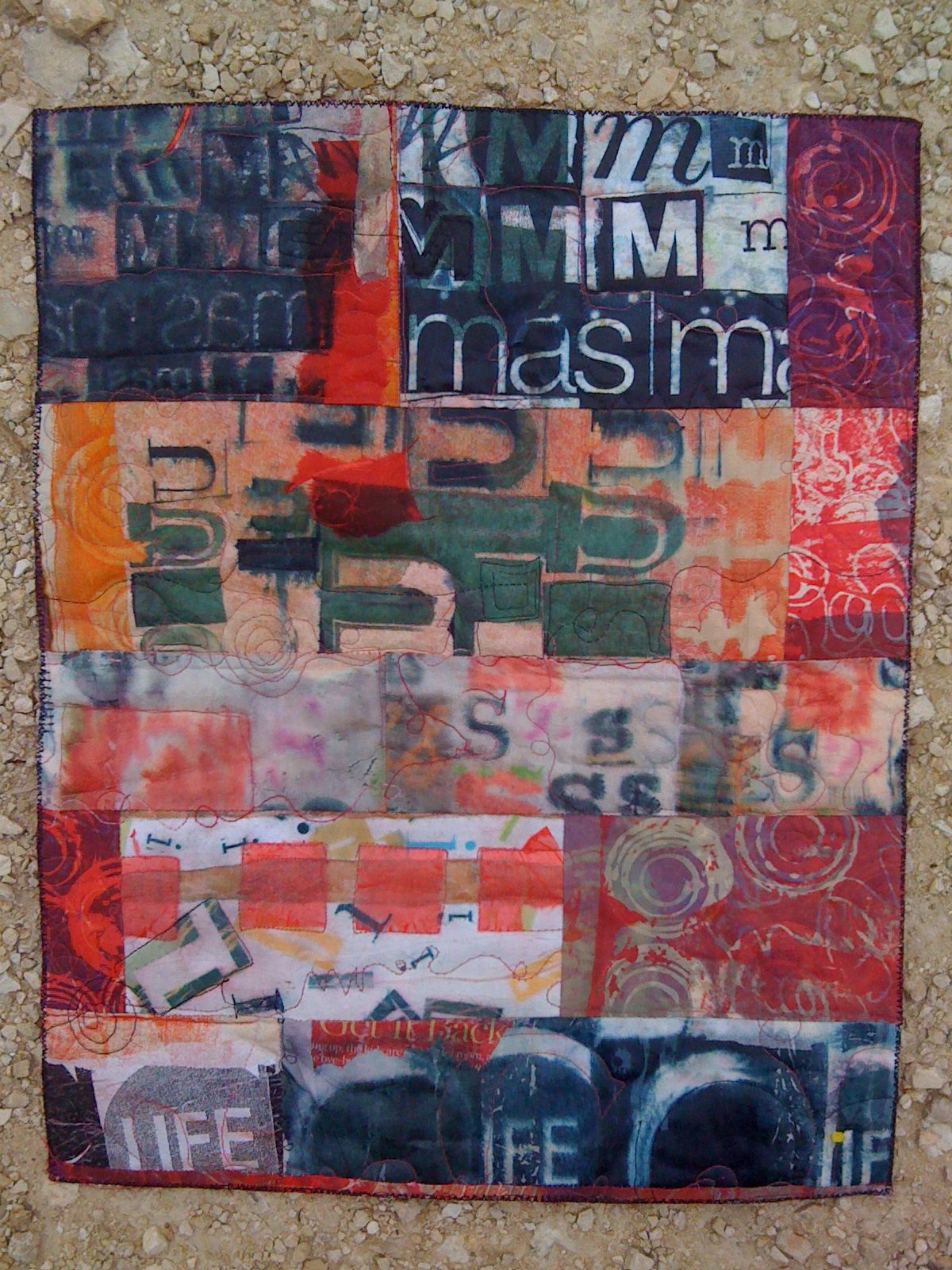
    Here are some tips that may help you make some interesting collages with your type collections:

    1. Work with CONTRAST:

    SIZE -- Use as wide a variety of sizes as you can. Collage the letters with varied sizes as neighbors to those of other size.

    VALUE -- Use strong contrast in value for the best copies -- black on white, red on white, dark hues on light pastels (AND vice versa) Avoid type -- or limit it -- that is too close in value to the background. Yellow reads as white and pale blues disappear on almost all copy machines

    DIRECTION -- GLue the letters down in different directions, try to make a "patchwork" of letters facing different ways, upside down, left to right, right to left.

    2. PATTERNS

    Try these different ideas as ways to glue down a text collection -- think of different rhythms and different patterns to develop collages that have different feelings and messages in their composition:

    swirling letters

    marching across the page letters

    letters lined up and making another shape

    a tornado, a wave, a spiral, a crawl, a race, a path, windows in a house, people in a crowd, letters arranged to make animal shapes or objects. (Like concrete poetry, but letters only) See the alphabet video here for examples:

    Letters on stage performing for other letters

    3. Follow the rule of 3s

    Use similar elements or copies of the same letter forms in odd-number arrangements: 3s, 5s, 7s. For some reason odd numbers of related shapes (etc.) always seem to work better in compositions.

    4. GROUPS not POLKA DOTS

    Arrange letters and elements close enough together that your eye "reads" the design with continuity -- just enough space between the elements (shapes, lines, dots, stripes, letters, etc) that your eye can easily leap to the next element, especially if it is a repeated element. Also, try to vary elements spacially, paying attention that you don't set up too regular a pattern (like polka dots) unless that is the rhythm you are trying for.


    Sunday
    Mar182012

    Art on the iPad

    These are a few of the art experiments I've made on the iPad this week, part of the iPad Art Studio online course that I am taking -- it's great and the tutorials that Jessica has included as the materials are so good -- she is really good at explaining technological steps and issues, and I'm learning a lot in that respect, too!

    Meanwhile, these were made using iPastel and Doodle Buddy. I really love the stencil features in DoodleBuddy, worth exploring those for fiber application alone...

    Friday
    Jan132012

    Loving the Internet, another reason

    Ok, it's a pill. And a time-suck. You can hear it just take the energy out of your day. But on the other hand, I just spent a little time in a discussion, bilingual, with a former student in Guatemala about the change of government now occurring. Example one of the connectivity. That was on Facebook with instant messaging.

    But even more to the point (as far as time spent), as a traveler who loves adventure, I have found a new tool for finding the perfect place to stay: Airbnb. As in Air Bed and Breakfast -- though the listings range (in theory) from treehouses to shared flats to luxury apartments. We are planning a trip in Spain this summer and I just booked a week long stay sharing an apartment in Barcelona and a private apartment loft in Madrid for three days. In between, we will be walking the last stage of El Camino de Santiago, St. James Way, a pilgrimage walk that has a long history, and was recently spotlighted in the Martin Sheen film THE WAY.

    After a day of exploration, yes, a day, I found just the right spots. These are places you can't find anywhere else on the web. I reccommend the process, and the reviews -- and recommendations from friends -- seem to suggest that this tool is right on target. I'll let you know when its all in the box!