

App of the Week: THINK
 The app.
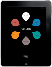
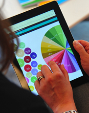
This week's app is one just for inspiration and information: THINK by IBM. It's a world of information, infographics and cool ideas -- I am using some of the mapping info in some new pieces of work. Most of all, THINK is an example of the new kinds of publications that web-based content makes possible: visual, nonlinear, beautifully designed.
Here's how IBM describes it on the page about the exhibit and the app.
(Some readers reported issues with the link -- still works for me, but here's the link to the itunes app page as well. )
An exploration into making the world work better
Consider the advances of the past century. The way science has improved our daily lives. The possibilities unleashed by technology. The things we can do today that earlier generations could not even imagine.
Yes, this is about better information, tools, algorithms—but that's not all. It's about the deeply human quest to make the world more livable, safer, more efficient, more sustainable. Our enduring drive for progress has given us the capacity to see the world with greater clarity... to map what we see... to understand its dynamics. All of which builds shared belief... in a better future, and in the way each of us can act to make it so.
 Lesson plans that go with the app and exhibit.This is part of IBM's commerical and cultural DNA -- it draws on the same tradition that saw Ray and Charles Eames designing interesting and novel exhibits in NYC for the company.
See what you think and tell me one idea you have for using what you see in your own work in the comment section, and I'll enter your name in a giveaway for a copy of THE MISSING ALPHABET, The Parents Guide to Developing Creative Thinking in Kids.
P.S. I hope you'll sign up for my newsletter and stay in touch as I launch a round of great iPad workshops online. Either use the form on the sidebar or go to this link: http://mad.ly/signups/69874/join
 Technology