


Designing with Type Shapes
As part of my online Joggles course (get the full story here) I'll be doing an occassional post here that my online students can use for further ideas; maybe those of you reading along can pick up a tip or two as well.
I've been pondering collage design with type and "found letters," those cut from magazines and newspaper or even spit out in differing sizes from your computer font library. Putting them together quickly, then arranging, rearranging and copying out bits and pieces in differing sizes is how I like to work on these random text collages -- I am not necessarily going for a literal message, more just the feel of type as shape and form and texture. But there is also an interesting challenge in using the letters of a meaningful or intriguing word that you might want to have as a kind of hidden message in a piece.
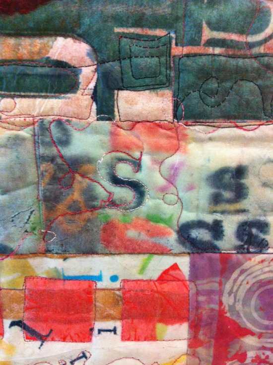
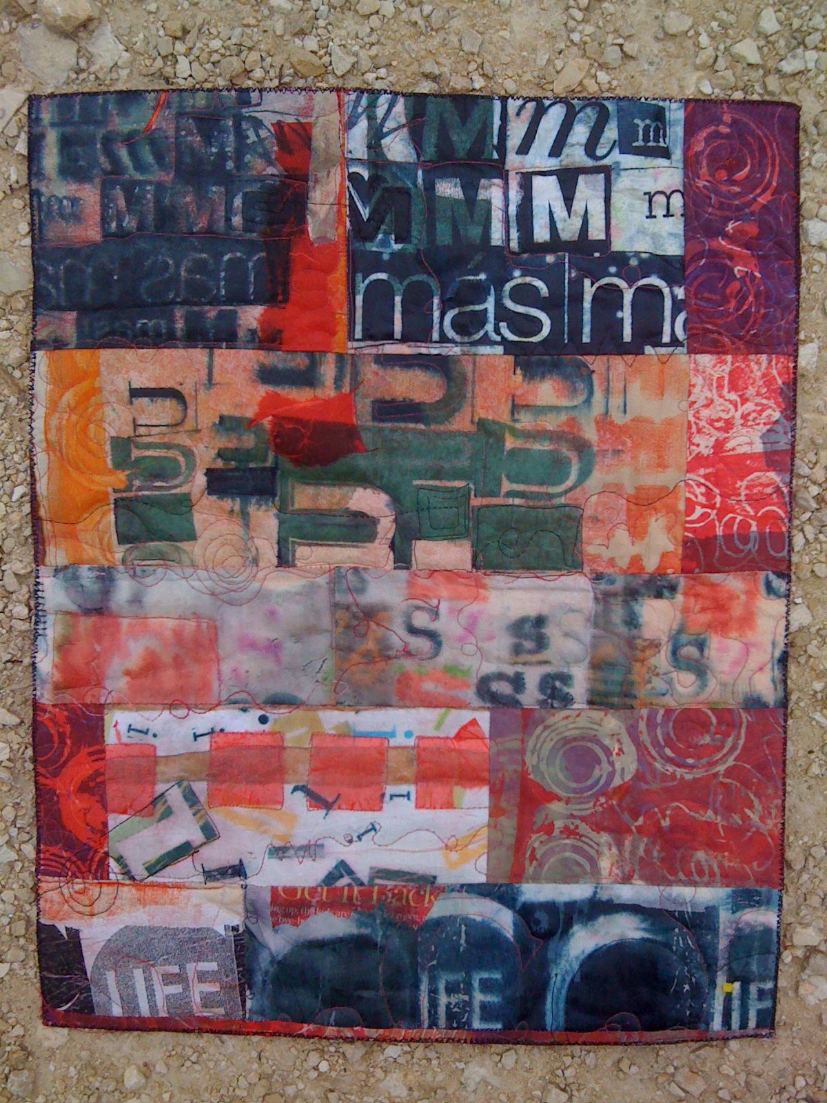
For example, this piece, while primarily a strong and bold composition, with text that pops out -- mas (Spanish for more) and LIFE from the classic magazine title -- also includes the "hidden message" "music." Each horizontal pieced band of fabric is a repetition of each letter M, U, S, I, C in order.
Here are some tips that may help you make some interesting collages with your type collections:
1. Work with CONTRAST:
SIZE -- Use as wide a variety of sizes as you can. Collage the letters with varied sizes as neighbors to those of other size.
VALUE -- Use strong contrast in value for the best copies -- black on white, red on white, dark hues on light pastels (AND vice versa) Avoid type -- or limit it -- that is too close in value to the background. Yellow reads as white and pale blues disappear on almost all copy machines
DIRECTION -- GLue the letters down in different directions, try to make a "patchwork" of letters facing different ways, upside down, left to right, right to left.
2. PATTERNS
Try these different ideas as ways to glue down a text collection -- think of different rhythms and different patterns to develop collages that have different feelings and messages in their composition:
swirling letters
marching across the page letters
letters lined up and making another shape
a tornado, a wave, a spiral, a crawl, a race, a path, windows in a house, people in a crowd, letters arranged to make animal shapes or objects. (Like concrete poetry, but letters only) See the alphabet video here for examples:
Letters on stage performing for other letters
3. Follow the rule of 3s
Use similar elements or copies of the same letter forms in odd-number arrangements: 3s, 5s, 7s. For some reason odd numbers of related shapes (etc.) always seem to work better in compositions.
4. GROUPS not POLKA DOTS
Arrange letters and elements close enough together that your eye "reads" the design with continuity -- just enough space between the elements (shapes, lines, dots, stripes, letters, etc) that your eye can easily leap to the next element, especially if it is a repeated element. Also, try to vary elements spacially, paying attention that you don't set up too regular a pattern (like polka dots) unless that is the rhythm you are trying for.
 Susie Monday

Reader Comments