Susie Monday

Artist, maker, teacher, author, head cook and bottlewasher.

Sign up here for monthly newsletters from me!

The art I make is the result of a life-long love of pattern, texture and color. How I teach is a skill honed by experience (I started teaching creative arts to younger kids when I was 12). After earning a B.A. in Studio Arts from Trinity University, I helped lead an internationally recognized educational foundation, designed curriculum exhibits for schools and other institutions, wrote and edited for a major daily newspaper, opened the San Antonio Children's Museum and then, a dozen years ago, took the scary but essential (for me) leap to become a fulltime artist and art teacher.

About This Blog

This weblog is about the maker's life. The teacher's path. The stitching and dyeing and printing of the craft of art cloth and art quilt. The stumbling around and the soaring, the way the words and the pictures come together. Poetry on the page and in the piecing of bright scraps together. The inner work and the outer journeys to and from. Practicalities and flights of fancy and fearful grandeur, trivial pursuits and tactile amusements. Expect new postings two or three times a week, unless you hear otherwise. 

To reach me, leave a comment after a post, OR email me at susiemonday@gmail.com 


To receive a notice of new posts in your email, scroll down this column to the end of the page and subscribe via FEEDBLITZ or add this blog to your own subscription service. You can search the blog with any phrase or word, by typing it into the seach window below:

Subscribe .. Or Write Me!

Subscribe to a email feed of this blog by filling in your email address in this box. Your email will not be sold or shared with others.


Preview | Powered by FeedBlitz


This form does not yet contain any fields.
    Login

    Entries in technique (5)

    Thursday
    Mar292012

    Traveling with Text 

    With my aquisition (thanks to birthday bonanza from Linda) of a NEW iPad with the camera, I am afire with digital imaginings. Here are some of my most recent experiments using several iPad apps one on top of another, as well as a few text-based Mixel collages.

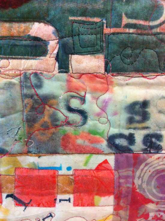
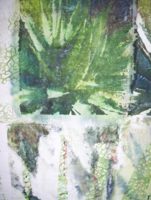
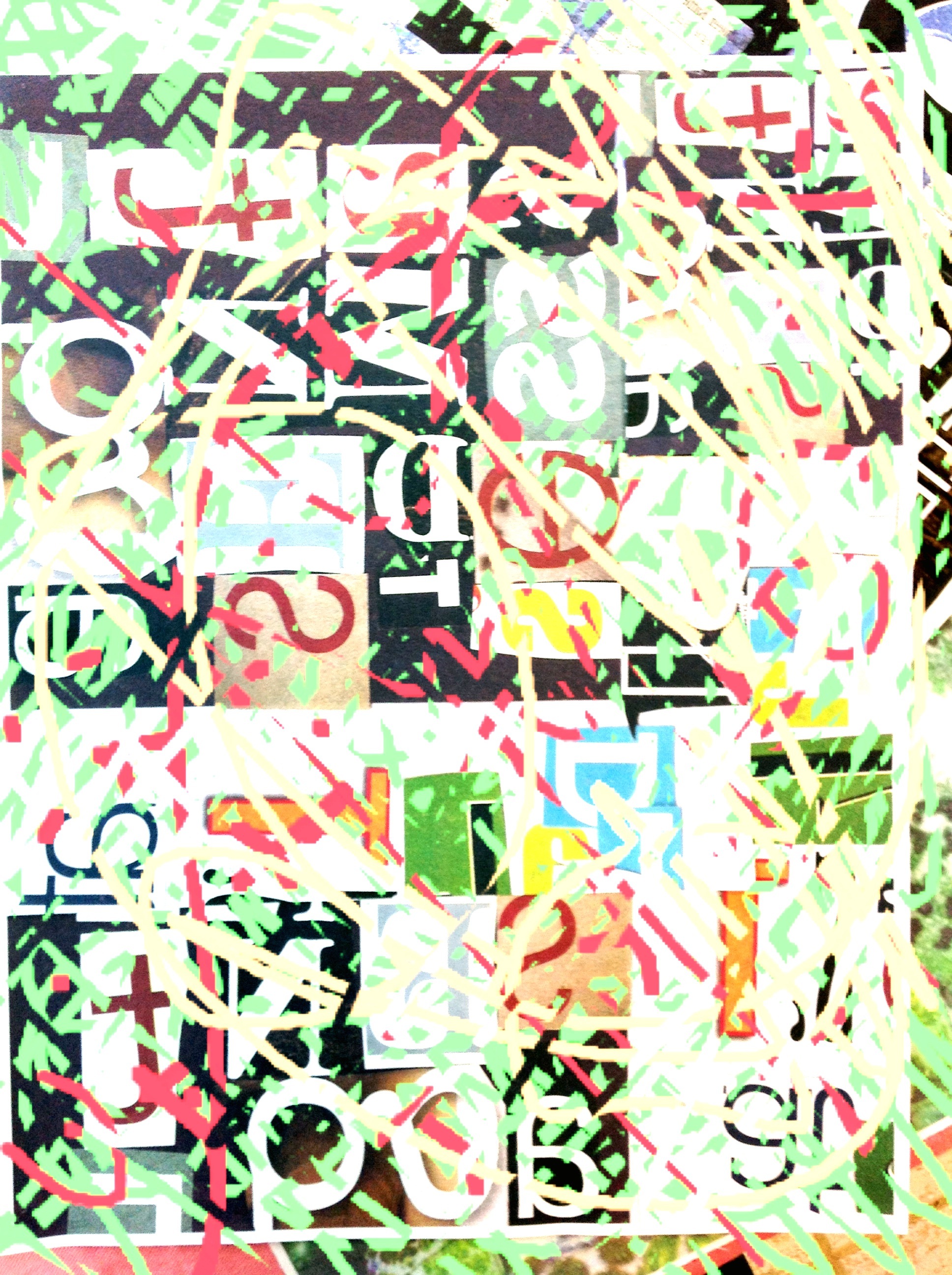
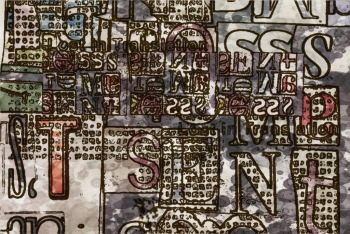
    The one above was a "physical" collage made with text cut from magazines (one of the exercises in my Text on Textiles courses, like that I am teaching on Joggles right -- and in the summer semester, too). I then photograhed it with the smart phone, sent it to the Cloud and my iPad and altered the colors with an app called PhotoPad (free, and a good photo editing tool). Then I drew on top of that saved image with some other tools and also erased part of the  image -- it looks to me like "Pollock takes on text."

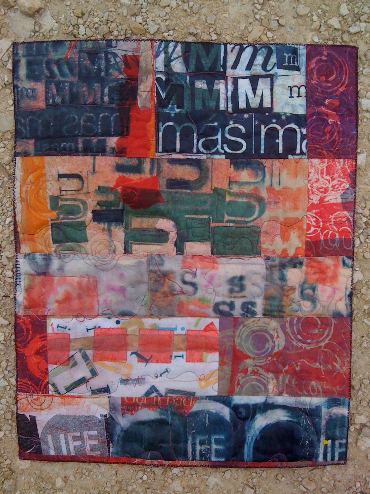
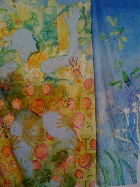
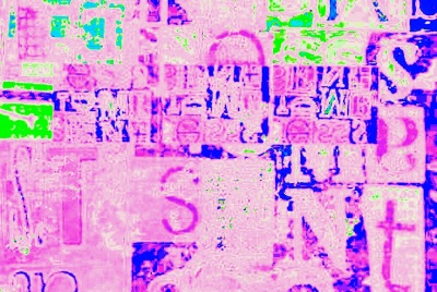
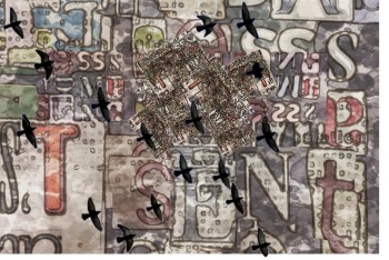
    Below is another physical collage that was altered, first with an iPad app called ArtistaHaikuHD that gives one a variety of watercolor effects/filters to use on photos.  Then I loaded that saved image into the PhotoPad App and played around with the colors. Que Cool!

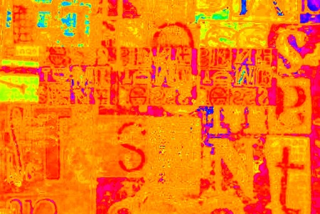
    Here's the watercolor versions in ArtistaHaikuHD:

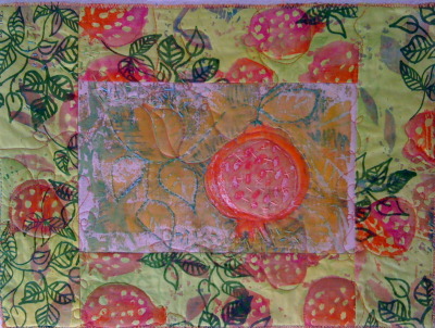
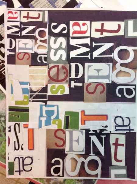
    How did I start? You can see the original here. 

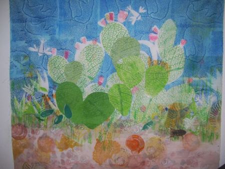
     Or, rather the intermediate stage that was done on Mixel. The first product was actually this little 4 by 6 collage (shown here with two copies taped together):

    WOW! It's amazing how these tools can morph one image SO MANY ways. I love to play with the possiblilities -- so the challenge is not in fluency, it's in when to quit and put my hands back on the wheel, so to speak. Where does what I can do only with hands happen?
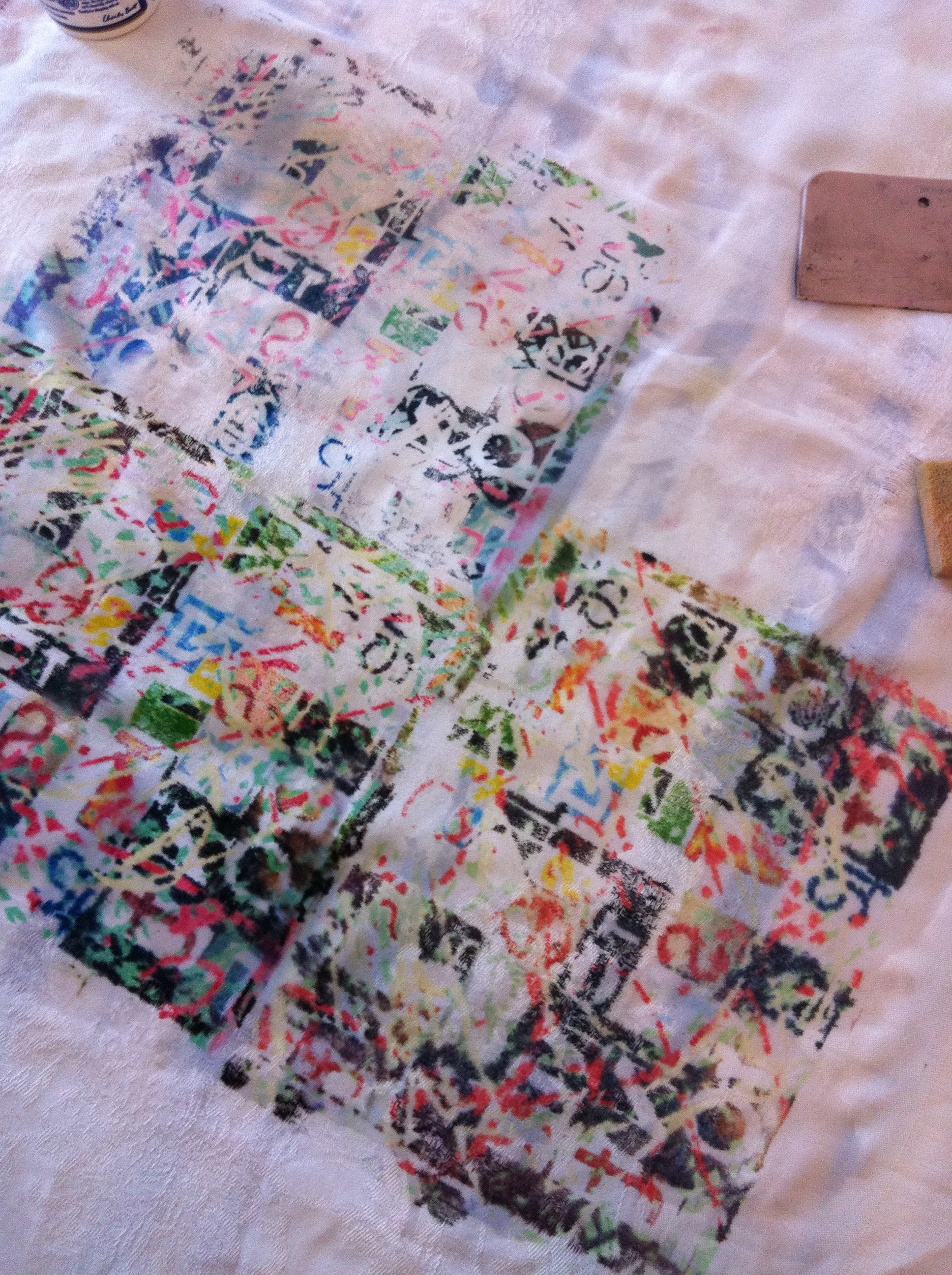
    Here's one way:

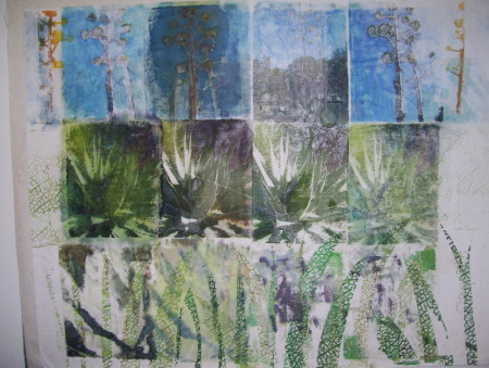
    Print it with inkjet transfers on an old piece of tablelinen:


    Sunday
    Mar182012

    Designing with Type Shapes 

    As part of my online Joggles course (get the full story here) I'll be doing an occassional post here that my online students can use for further ideas; maybe those of you reading along can pick up a tip or two as well.

    I've been pondering collage design with type and "found letters," those cut from magazines and newspaper or even spit out in differing sizes from your computer font library. Putting them together quickly, then arranging, rearranging and copying out bits and pieces in differing sizes is how I like to work on these random text collages -- I am not necessarily going for a literal message, more just the feel of type as shape and form and texture. But there is also an interesting challenge in using the letters of a meaningful or intriguing word that you might want to have as a kind of hidden message in a piece.

    For example, this piece, while primarily a strong and bold composition, with text that pops out -- mas (Spanish for more) and LIFE from the classic magazine title -- also includes the "hidden message" "music." Each horizontal pieced  band of fabric is a repetition of each letter M, U, S, I, C in order. 

    Here are some tips that may help you make some interesting collages with your type collections:

    1. Work with CONTRAST:

    SIZE -- Use as wide a variety of sizes as you can. Collage the letters with varied sizes as neighbors to those of other size.

    VALUE -- Use strong contrast in value for the best copies -- black on white, red on white, dark hues on light pastels (AND vice versa) Avoid type -- or limit it -- that is too close in value to the background. Yellow reads as white and pale blues disappear on almost all copy machines

    DIRECTION -- GLue the letters down in different directions, try to make a "patchwork" of letters facing different ways, upside down, left to right, right to left.

    2. PATTERNS

    Try these different ideas as ways to glue down a text collection -- think of different rhythms and different patterns to develop collages that have different feelings and messages in their composition:

    swirling letters

    marching across the page letters

    letters lined up and making another shape

    a tornado, a wave, a spiral, a crawl, a race, a path, windows in a house, people in a crowd, letters arranged to make animal shapes or objects. (Like concrete poetry, but letters only) See the alphabet video here for examples:

    Letters on stage performing for other letters

    3. Follow the rule of 3s

    Use similar elements or copies of the same letter forms in odd-number arrangements: 3s, 5s, 7s. For some reason odd numbers of related shapes (etc.) always seem to work better in compositions.

    4. GROUPS not POLKA DOTS

    Arrange letters and elements close enough together that your eye "reads" the design with continuity -- just enough space between the elements (shapes, lines, dots, stripes, letters, etc) that your eye can easily leap to the next element, especially if it is a repeated element. Also, try to vary elements spacially, paying attention that you don't set up too regular a pattern (like polka dots) unless that is the rhythm you are trying for.


    Tuesday
    Aug242010

    Rainbow Printing for Free Download

    I'm off to the CREATE mixed media retreat at Chicago/O'Hare and the good news is, I found the pdf for my rainbow printing handout that's been lost in inner space here on the Susie Monday macintosh! I'm sending it upstairs to the cloud for access, so if you've been wanting this handout (it's not  as complete and as multimedia as the info I'll be sharing in the course, of course, but it will get you started I think!)

    In order to download the three page document (the last page is just a schedule of how the workshop is structured) please to go to my public document folder at me.com

    I have been advised that some browsers don't like the me site, use Firefox or Safari if you can! Otherwise, email me through the contact form and I will send an email copy to you. (I have tried a new non-compressed document, so this may work for you!)

    If you can't make the link above work, try pasting this direct url into your browser:


    files.me.com/susiemonday/2joate 

    Thursday
    Nov122009

    Surface Design Technique: Polyester Film Transfers

    Polyester film transfer on cotton, "Century Plant

    I am doing some transfers of photos using polyester film (it's a wet media product made for graphic artists) with my ink-jet printer and then adding gel medium or fabric medium to melt and blend the photographic images-- which also makes them permanent (if a bit stiff). This spiral piece also has a thermofax screen print ontop (the charcoal dotty stuff).


    This is a logical progression from some of the screened water-soluble medium work that I also have been doing lately.

    And what is it with the nature imagery. I hope I am not turning into the quilt art equivalent of a boring bluebonnet painter....


    Let me know what you think. Should I quilt these as whole cloth quilts?