Susie Monday

Artist, maker, teacher, author, head cook and bottlewasher.

Sign up here for monthly newsletters from me!

The art I make is the result of a life-long love of pattern, texture and color. How I teach is a skill honed by experience (I started teaching creative arts to younger kids when I was 12). After earning a B.A. in Studio Arts from Trinity University, I helped lead an internationally recognized educational foundation, designed curriculum exhibits for schools and other institutions, wrote and edited for a major daily newspaper, opened the San Antonio Children's Museum and then, a dozen years ago, took the scary but essential (for me) leap to become a fulltime artist and art teacher.

About This Blog

This weblog is about the maker's life. The teacher's path. The stitching and dyeing and printing of the craft of art cloth and art quilt. The stumbling around and the soaring, the way the words and the pictures come together. Poetry on the page and in the piecing of bright scraps together. The inner work and the outer journeys to and from. Practicalities and flights of fancy and fearful grandeur, trivial pursuits and tactile amusements. Expect new postings two or three times a week, unless you hear otherwise. 

To reach me, leave a comment after a post, OR email me at susiemonday@gmail.com 


To receive a notice of new posts in your email, scroll down this column to the end of the page and subscribe via FEEDBLITZ or add this blog to your own subscription service. You can search the blog with any phrase or word, by typing it into the seach window below:

Subscribe .. Or Write Me!

Subscribe to a email feed of this blog by filling in your email address in this box. Your email will not be sold or shared with others.


Preview | Powered by FeedBlitz


  • Contact Me

    This form will allow you to send a secure email to the owner of this page. Your email address is not logged by this system, but will be attached to the message that is forwarded from this page.
  • Your Name *
  • Your Email *
  • Subject *
  • Message *
Login

Entries in Sensory Alphabet (15)

Wednesday
Sep092009

Light, illuminating new ideas

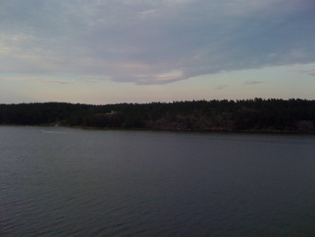
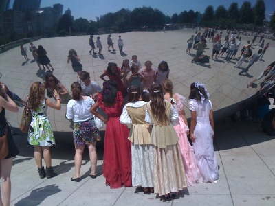
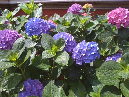
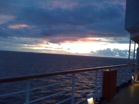
Sometime around midnight, somewhere in the Baltic SeaPerhaps the most stunning and interesting photographs from my recent travels in Scandinavia were those with strong LIGHT content -- not only because photography is all about light, but because the quality of those 20 plus hour days of daylight were so potently active as to our psychic relationship to the space and time. Daytime has a much more expansive meaning when the sun "goes down" at about 11:30 pm and rises at 3 am, and truely, it never is really dark. The white nights of Russia, Finland, Sweden certainly color the activity and spirit of the places. Even though we were ship-bound in the evenings and nights due to our sailing schedule, it was easy to see that the lives of all the ports went on way into the wee hours. There were truely more hours in the day to do things and in general, people seemed intent upon enjoyment of all the pleasures of daylight. Guess it shapes your summer when you know 18 hours plus of dark is coming all too soon!

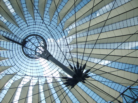
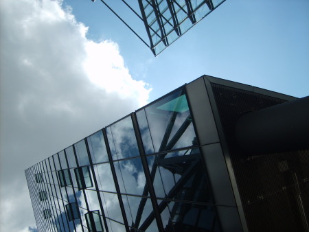
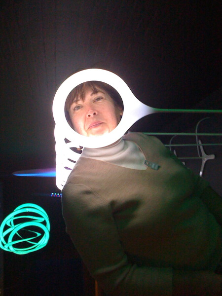
Linda in a Light exhbit at the Design Museum in Copenhagen
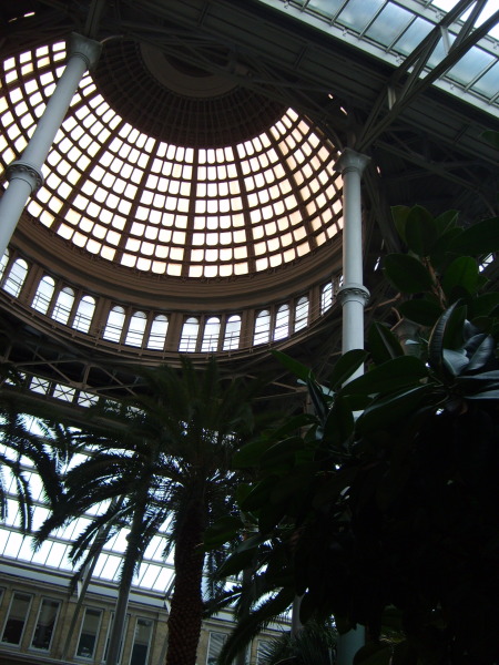
Conservatory at the Sculpture Museum, Glyptotek, in Copenhagen. 
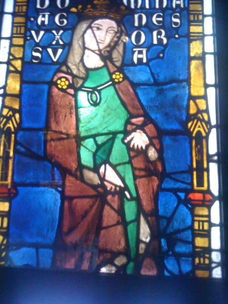
Along the River Neva, St. Petersburg White Nights
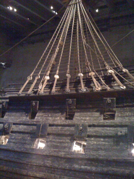
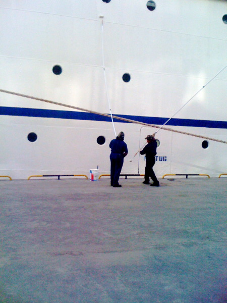
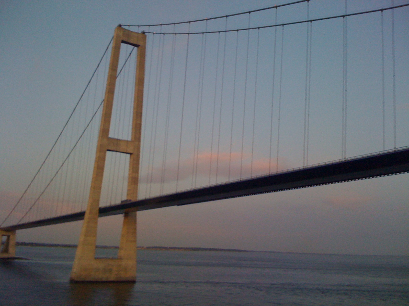
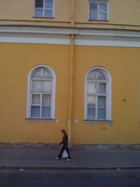
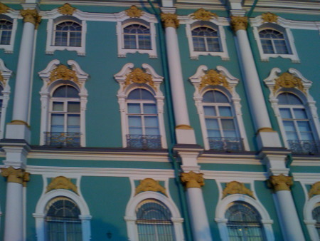
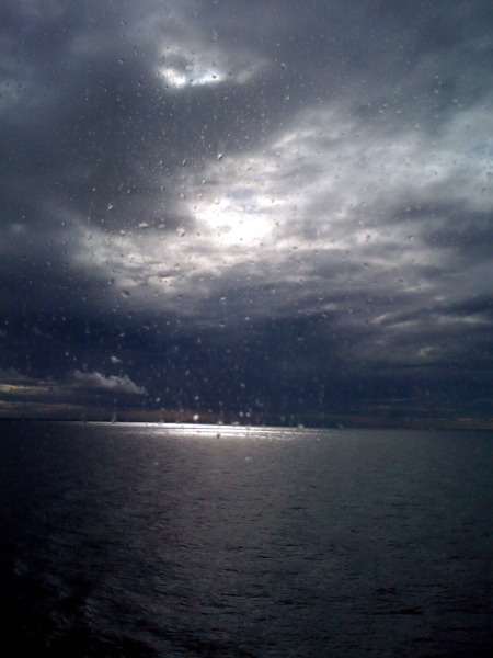
More from the ship


Tuesday
Sep082009

Back on Travel: Line Photos

Carved type from the V&A, London

Now that business is posted (if you missed the latest on the workshop front, either download or go back a day for details) I want to continue my posts of photos from the summer's wonderful journey through Scandinavia. I'm posting these by Sensory Alphabet category --just for fun, and because this blog serves me as a kind of collection jar for memorie, studio actions, future ideas and playdates with ideas.

So today's idea is LINE. Here are some of the photos I took that jumped out of iphoto:

Potsdamplatz, Berlin

Stockholm horizonVasa rigging, StockholmRepainting the line

Bridge between Sweden and Denmark

Tallinn street scene

The line the wall made, Berlin

Berlin

Monday
Aug312009

World Shapes: Art-making Inspired

Memorial to the Murdered Jews of Europe, Berlin

Next up: the  shape collection from the summer travels. (Previous installments in the two previous posts include Movement and Color, see the sidebar for links.)
Some things I might try from these inspirations:

1. Think of the grid as a pattern of shapes and use it as did the artist who designed the Berlin Holocaust Memorial.

2. Try making a columnar shaped art quilt, like the Estonian tower.

3. Use the paving stone and manhole cover collection (I took lots of these photos) to make thermofax screens for an art cloth series.

4. Use the shapes of the plaster casts from the Victoria & Albert Museum to inspire some altar-shaped pieces.

5. Make a phototransfer of that lovely urn from Kensington Garden.

 Manhole Cover - Berlin

Newton, Sculpture at the British Library

Tower in Tallinn, Estonia, UNESCO World Heritage Site

Medieval stone carving, plaster cast at the V&A, LondonUrn, Kensington Gardens, London

Sunday
Aug302009

Color: trip photos + how to use them

 Tallinn, Estonia, Old Town

More photos from the Scandinavian trip this summer: these screamed "color" when I went though the digital stacks. I love digital photography, but you have to admit that it makes editing an essential part of the process. Back in the film days, I could never have brought home 2000 plus photos! If you've just tuned in, I'm taking the next seven days (plus yesterday and today) to post pictures from our big summer trip/cruise sorted by categories of the Sensory Alphabet.

Here are some ways that colors in photogrphs (my own and other's) inspire my work:

1. If theiy're mine, I use the photos directly, printed on fabric or other strange materials, then use them as a collage element in my art quilts, or even as stand-alone small fiber pieces with stitching and over-printing.

2. I notice what works compositionally with color in a favorite photo, then let that proportion or relationship inform a piece of work.

3. I like to play a color matching game, mixing colors of paint or dye to match a color that I find striking in a photo or painting.

4. Especially with photos of the natural world, I find new and unusually color schemes that I wouldn't ordinarily think about. Coor is such an important element in my work, I am always working from both intuitive.

While specific images from this trip have not yet found their way into my work, I have gotten some interesting ideas for some new workshops, coming soon to this blog. Meanwhile, here's the color selection to inspire your work!


Grocer's shelf near Highgate Village, LondonHydranga blooms at the V&A, London

Very old stained glass panel in the V&A collection

 St. Petersburg, Russia

Summer Palace outside St. Petersburg