
Color at the Edge
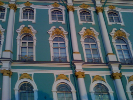
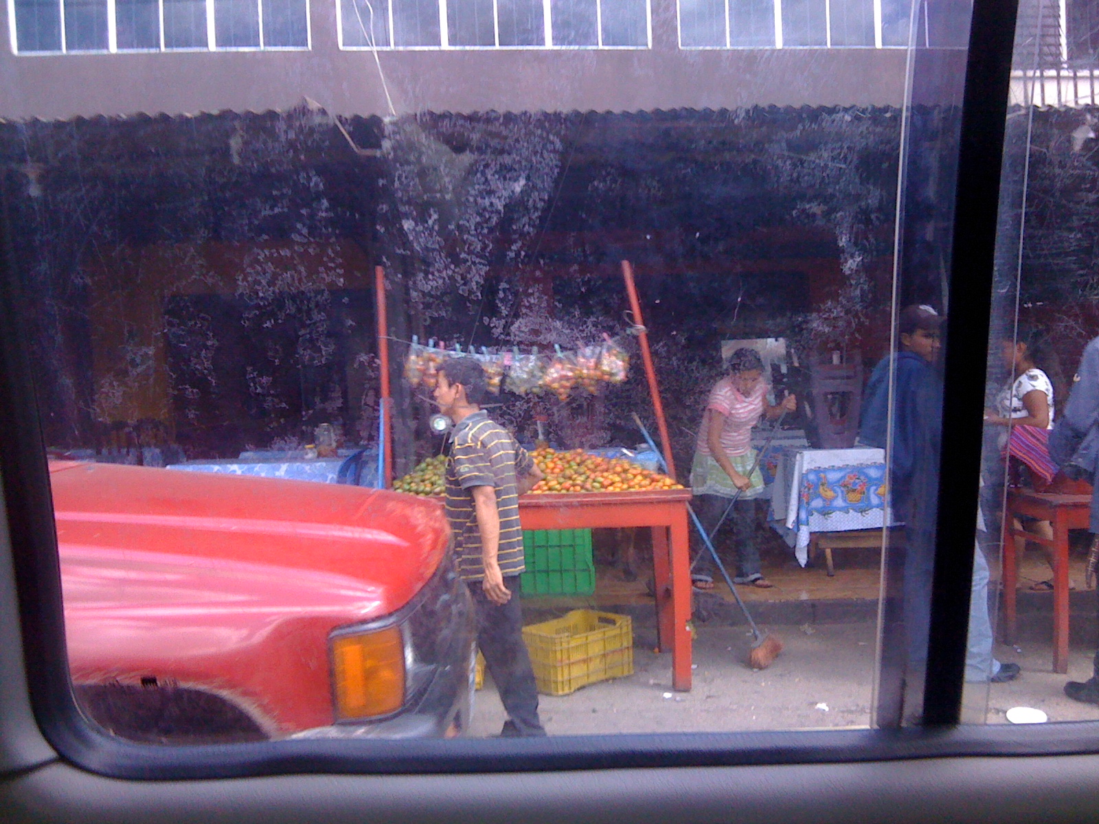
Come along on a color adventure! My recent trip to Central America was, obviously, a trip through the lands of color. In both countries (as in much of Latin America) a ride through any city, a walk through any market, an exploration of the arts and crafts takes one straight into the heart of color.
Since I consider color as one of my strong suits -- where I start most of my work -- this trip was like visiting the guru on top of the mountain (volcano is more appropriate, I guess) -- a trip to my own Mecca. Working with color is where my heart goes when I work, and I consider myself a pretty masterful color craftsman, and my work is bold and brave in its palette usually. Now, I like more subtle palettes, too, and sometimes use their "rules," and I certainly love the work of artists whose palettes aren't as bright as my own.
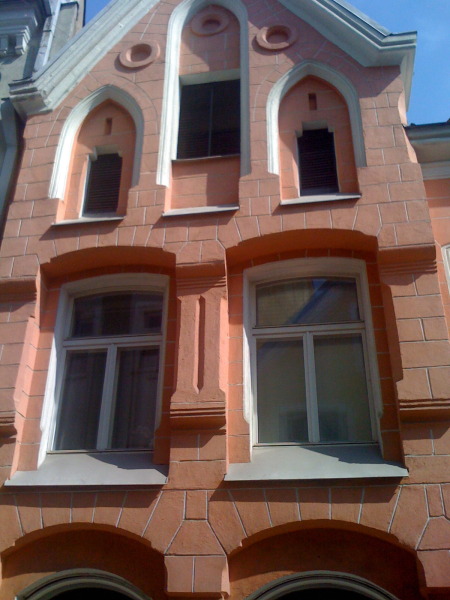
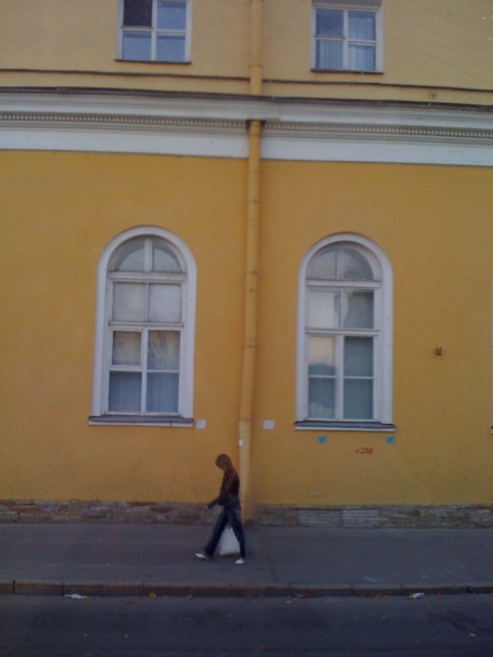
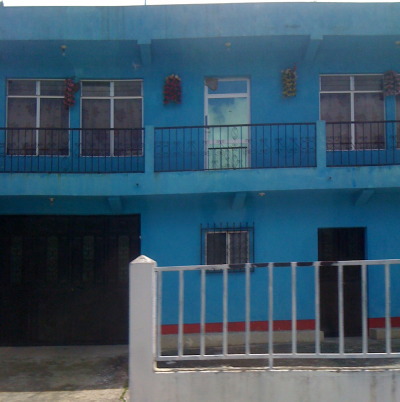
Even so, when I stop and look at some of the photos I took on this trip, (many of them snapped out of the van window as we speeded by) my eyes are amazed. Certainly "what works" takes on an entirely new set of parameters. For example, just what doe s that little stripe of reddish orange do for the blue house in the photo at the top of the blog?
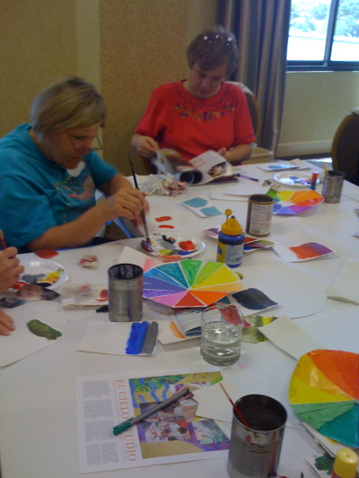
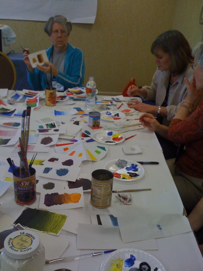
As I plan my next El Cielo workshop on COLOR (coming up in November with new exercises in dye and paint, fabric and paper) I am finding some interesting new exercises inspired by some of these photos. I'll use some interesting software web-based color tools (more later) and provide some parameters for some fabric collage mini-quilt assignments. If you'd like to join in for the LIVE and UP FRONT experience, sign up for the workshop -- or just follow along on this blog for some every-once-and-a-while color updates. You will be able to find the exercises when you click on the KEYWORD COLOR on the sidebar, OK?
Here's the first assignment:
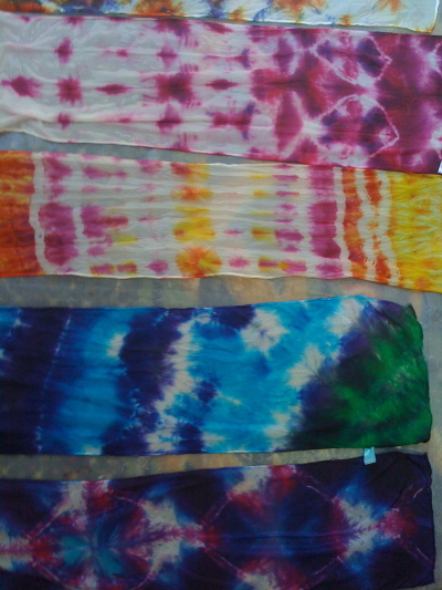
1. Take any solid color of tissue, construction or other art paper. Choose a color you like, but not one that you use all the time, just to stretch the eye muscles. Cut twelve 6" by 6" squares of the same color.
2. Cut 18 different solid color strips each 1/2" wide and 6" long from different papers -- or paint some papers with any bits of tempera, acrylic or craft paint. Just work randomly with favorites, or with what ever you have around you.
3. At the bottom of six of the squares, about 1" above the bottom edge, glue one of the 1/2" strips of a different color. On these six squares, try to find the absolutely most interesting, most pleasing, most shocking combinations. Don't play by any presupposed rules at this point.
4. Now, cut 1 1/2" strips (6" long as well) of the SAME colors you chose. Glue those 1" above the bottom edge. What happens when the AMOUNT of color contrast changes? Which do you like the best?
5. Now look at your squares with a color wheel in hand (or on the screen). What "rules" for your color choices can you deduce? Did you choose complementary colors, split complementaries? analogous? What did the different amounts of the secondary color show you about your choices? Try cutting some 3" wide strips of the secondary color and see what they do when the amounts on a square are equal... (You may need to make some more 6" squares at this point.)
6. And now, just for fun, combine all your squares into a pieced quilt pattern on your design wall. Since the predominant color will still hold dominance in quantity, you may find that the design is wonderfully striking and interesting. A starter for a small wall quilt, perhaps?
 Susie Monday