Susie Monday

Artist, maker, teacher, author, head cook and bottlewasher.

Sign up here for monthly newsletters from me!

The art I make is the result of a life-long love of pattern, texture and color. How I teach is a skill honed by experience (I started teaching creative arts to younger kids when I was 12). After earning a B.A. in Studio Arts from Trinity University, I helped lead an internationally recognized educational foundation, designed curriculum exhibits for schools and other institutions, wrote and edited for a major daily newspaper, opened the San Antonio Children's Museum and then, a dozen years ago, took the scary but essential (for me) leap to become a fulltime artist and art teacher.

About This Blog

This weblog is about the maker's life. The teacher's path. The stitching and dyeing and printing of the craft of art cloth and art quilt. The stumbling around and the soaring, the way the words and the pictures come together. Poetry on the page and in the piecing of bright scraps together. The inner work and the outer journeys to and from. Practicalities and flights of fancy and fearful grandeur, trivial pursuits and tactile amusements. Expect new postings two or three times a week, unless you hear otherwise. 

To reach me, leave a comment after a post, OR email me at susiemonday@gmail.com 


To receive a notice of new posts in your email, scroll down this column to the end of the page and subscribe via FEEDBLITZ or add this blog to your own subscription service. You can search the blog with any phrase or word, by typing it into the seach window below:

Subscribe .. Or Write Me!

Subscribe to a email feed of this blog by filling in your email address in this box. Your email will not be sold or shared with others.


Preview | Powered by FeedBlitz


This form does not yet contain any fields.
    Login

    Entries in photographs (4)

    Wednesday
    Apr062011

    From Photo to Fabric -- Image Prep for Thermofax

    Continuing the on-line investigations today (yes, I'm home and laying low with a spring cold, it seems), I've been looking for a good on-line photo editor that will take the place of PhotoShop for those of my students who don't own the software. 


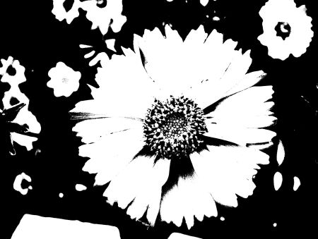
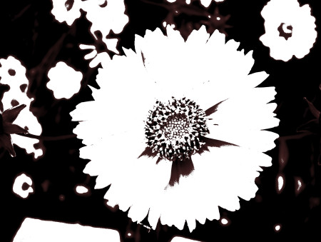
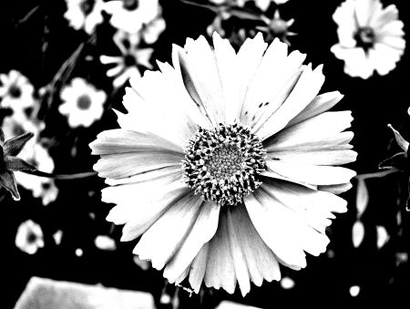
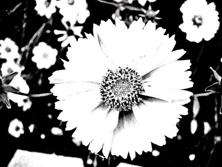
    The original photo

    Since my knowledge of Photoshop can be contained in a thimble (I use it exclusively to resize photos and to turn photos into high contrast black and white images to use to make thermofaxes), it doesn't take too much to satisfy this tech need. And I found much more than needed with Pixlr. And even Pixlr Express will do what I need for converting to a thermofax-friendly image. Pixlr has been around for a while so it may be familiar to you -- best of all, of course, it's free and it takes up no room on your computer. You can save the images you create or alter into several different formats including jpeg and tiff files.

     The photos in this post show several different conversions using different tools in the software. Here are the tips I can share so far: use "desaturate" to convert from color to black-and-white. Up the contrast all the way, adjusting brightness as you see fit. These actions take place under the "Adjustments" tab at the top of the image editor. Then under "Filters" apply the "art poster" effect, moving the toggle switches to see what different effects you get. If you want a "noisy" print, use the NOISE filter before you play around with art poster.

    Try your own combinations of actions and order of actions to vary the image. You'll find a rich field of image ideas to convert to thermofax screens, stencils, traditional screen-prints or even stamps with cut foam or surestamp.


    Tuesday
    Jul272010

    The Breakfast Project

    What does breakfast look like around the country? The world? Your house?

    I'm working/playing with a group of 7-to-9 year old creative thinkers this week at the Aldrich Contemporary Art Museum in Connecticut in the second course of our New World Kids program -- it's called "Think Like a Pro," and introduces our young alumnae of NWKs to a more indepth look at their own creative process as well as a look at how different people in different fields approach creative work.

    One of our projects -- combining social media, the theme of home and an installation designed by the kids -- has to do with collecting breakfast photos.

    Here's the email that the kids came up with (with a couple of additions) and your instructions. Feel free to copy the request and send it out -- we want to see the diversity of what we humans eat each morning and the more, the better. Deadline for submissions is THIS THURSDAY at noon, since our exhibit (online and inhouse) goes live on Saturday. We'll send any who contribute a link to a site with all the photos.

    Hello friends!

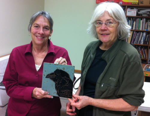
    We are collecting breakfasts from everywhere. Please email us a photo of your breakfast for our exhibition.
    Email it to: mybreakfast@me.com. We need it by noon on Thursday. (We'll send back a link to the results!)
    Thank you from the "Think like a Pro" class at the Aldrich in CT, USA! (Be sure and tell us where you eat breakfast!)

    Here is an example:
     

    More about the program, for those interested (from my colleague and co-author Susan Marcus' letter to the kids' parents):

    “TLAPro” is the second step on a path that we see as building a real literacy in creative thinking skills. It is designed much the same way as we teach any literacy...by first learning a symbol system, in the case the Sensory Alphabet. This was “New World Kids.”

    Next we start “scaffolding” thinking skills on that foundation. It’s the same way that the traditional alphabet leads to reading and numbers become the tools of arithmetic.


    Also at the heart of the NWK approach is the belief that learning should be learner-centered, that the development of individual potential should be priority one. We believe that creativity is “basic.” We know that it can be nurtured in all children...and at this time especially...it is important to give kids the “creative thinking tools” to create a meaningful life and deal with an unknown future.


    To get at individual styles we use the Sensory Alphabet as a lens to discern the constellation of strengths that we see in the patterns of each child’s creative work and behavior. Activities are carefully designed to bring out these patterns. We then share them with the parents. And you have all been a part of that. What we know from many years of applied research with kids is that these patterns of strengths don’t change. They are as indelible as a fingerprint. There is a great deal of research that supports this view, e.g., Howard Gardner’s Multiple Intelligences that has now grown into “differentiated instruction” in some classrooms — and in the last decade this idea is strongly supported by neuroscience.
    In TLAPro, the basic idea is to get kids working out of their individual strengths in conscious way. At about 7yrs old, this capacity for reflection begins to unfold developmentally. We are beginning to exercise and build these new capacities. We share the info we gave you all at the end of NWK with the children (in a simpler form, of course) and give them different formats and media to reflect on those ideas.

    We keep the Sensory Alphabet and the creative process in mind as we work/play. This week we observed different ways that “pros” think and use the tools of their professions. We heard how they solve problems and create. The children had the opportunity to try out those ways of thinking, use media and solve problems “like a pro,” in fact, like several diverse pros. And the important part we reflect on at this time is...which one is most fitting for my their natural strengths? Which one did they resonate with? Gave them the most ideas? Now they are beginning to get a grasp of the notion that some things might be difficult and hard to imagine, while others will be easy and engrossing — and that’s OK.

    There are several other “strands” that run through TLAPro:
    •    We are building reflective (metacognitive) skills by playing with different ways of envisioning information through infographics. (This is what you’ve seen coming home.) It is a basic kind of visual literacy that will serve them in interpreting visual information and later, being able to create their own. This will be a needed skill in the future and is an underpinning of “digital literacy.” At this stage, we’re observing, collecting and playing.

    •    We are playing with different ways of taking notes and reflecting on the experiences of the day.

    •    We are expanding the array of digital media that they are using to solve problems and create. Again, in simple, playful and creative ways. We’ll demonstrate these for parents on the last day.
    •    We are experiencing working both individually and consciously, as a group. This week, it was very simple and spontaneous. Next week we will go deeper.

    Next week will have a different structure. We will divide children into three small, like-minded groups to work with a Pro that is most like their natural way of thinking. We’ll have a 2D group, a 3D/builders group and a group that will work with social and kinetic sensibilities. We will be working with the theme of HOME and using several of the exhibitions now on view at the Aldrich as jumping off points. There one day of collecting ideas and trying out beginning thoughts, then two days of working with the Pros to complete a real piece of creative work. After that, we will work together to design a presentation for the parents that includes all the results. We will also experience documenting our work and putting it into a digital format. It will be a full week!

    Thursday
    Jul152010

    Inkjet to Art

    Before

    And after.

    I'm teaching an Inkjet to Art class in a few weeks at the Southwest School of Art and Craft. One of the great advantages of the school is the wonderful surface design studio. I can almost guarantee that every participant will have a large 8 foot studio table to work on! You can bring your printer to this class or use mine -- you'll learn three separate and distinctive ways to make inkjet transfers of images, photos, drawings -- what ever lives in your computer or can be placed on the glass of an all-in-one copy machine!

    For more information, go to the fiber class section of the school's websiter at www.swschool.org.

    Instructor :
    Class Level :
    Class Time :
    Membership :
    The selected item is full, please select a different item or combination


    Description

    Class Sessions: 2

    Maximum: 10

    Location: Surface Design Studio | Navarro

    Learn to print on unusual materials including plastic, interfacing, Tyvec, felt, fabrics of all kinds and films to use directly in art quilts, art cloth or mixed media art. You'll learn how to tease an inkjet printer into using unusual substrates, what kind of printers work best, and how to get around the size limitations of your printer by making poster prints online and using polymer medium to make prints with painterly qualities. If you like, bring your own inkjet printer or use the instructor's to learn the basics. Please see SSAC website for a materials list.

    Fee


    ID Number 2338  
    Fee $165.00

    Sunday
    Aug302009

    Color: trip photos + how to use them

     Tallinn, Estonia, Old Town

    More photos from the Scandinavian trip this summer: these screamed "color" when I went though the digital stacks. I love digital photography, but you have to admit that it makes editing an essential part of the process. Back in the film days, I could never have brought home 2000 plus photos! If you've just tuned in, I'm taking the next seven days (plus yesterday and today) to post pictures from our big summer trip/cruise sorted by categories of the Sensory Alphabet.

    Here are some ways that colors in photogrphs (my own and other's) inspire my work:

    1. If theiy're mine, I use the photos directly, printed on fabric or other strange materials, then use them as a collage element in my art quilts, or even as stand-alone small fiber pieces with stitching and over-printing.

    2. I notice what works compositionally with color in a favorite photo, then let that proportion or relationship inform a piece of work.

    3. I like to play a color matching game, mixing colors of paint or dye to match a color that I find striking in a photo or painting.

    4. Especially with photos of the natural world, I find new and unusually color schemes that I wouldn't ordinarily think about. Coor is such an important element in my work, I am always working from both intuitive.

    While specific images from this trip have not yet found their way into my work, I have gotten some interesting ideas for some new workshops, coming soon to this blog. Meanwhile, here's the color selection to inspire your work!


    Grocer's shelf near Highgate Village, LondonHydranga blooms at the V&A, London

    Very old stained glass panel in the V&A collection

     St. Petersburg, Russia

    Summer Palace outside St. Petersburg