(This blog is also posted on the Posterous site at http://escuelacass.posterous.com with many more photos there.)
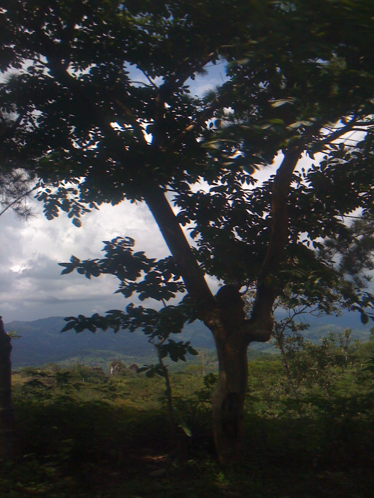
The clean air, the pines, steep tile-roofed houses with more wood in their construction than in other Salvadorean towns, the steep narrow streets lined with small shops, the smell of coffee roasting in a tin barrel roaster --these signal the mountain town of Perquín in the far reaches of the Departamento (like a state) of Morazán in northeast El Salvador. But Morazán and Perquín soon became more for me than names on the map after my visit to the little Museum of the Revolution.
Julia shared with us her first experience here, “When I first came to the Morazán, I had come with the pictures that were described by the teachers telling about their war time experiences. Many had left with their mothers and grandparents as refugees to Honduras. They showed pictures where the tropical mountain landscapes had literally been bombed to rocks.” When she arrived in 2001, the lush greenery and land was already in the process of recovery and the tasks of rebuilding had begun. During her first trip she was hosted by CASS teachers from 2000, Rolando Perez, Juan Bautista Chicas and Ana Delia Romero. They traveled by bus on a Friday afternoon from San Salvador to the Morazon Department Capital, San Francisco Gotero ( a trip that took 4 or 5 hours) and caught the last camioneta, for the 20 miles to the rural communities of Segundo Montes.
Julia remembered she had a reservation to stay in a B & B in Perquin, 20 miles to the north, but the students told her it was not possible, there was not transport there on the weekends. They had arranged everything: she would stay several nights with each of them. They had organized transport to see the schools and the region with a local man who owned his own truck. She remembered her first visit in Morazan, via the specially arranged camioneta, “Traveling throughout all the rural communities in Segundo Montes to witness the process of rebuilding after the devastations of war: schools, homes, churches, community centers, with the help of NGOS and churches from all over the world."
Part of the itinerary of that incredible education trip was a visit to Perquín, to visit the Museum of the Revolution and to further north to witness the mountain routes the teachers’ families (the women, young children and old people) had traveled to escape the death squads burning and bombing the communities right behind them. There were photos of Rolando as a 4 year old in front of a church in the refugee communities in Honduras. Another photo captured a 14 year old Miguel (our driver that day) two weeks before a grenade exploded in his hands (Miguel received reconstructions and prosthesis limbs in hospitals in Cuba ). Julia remembers an incredible emotional day of learning with these young teachers traveling with a handicapped veteran from the revolution on poor mountain roads with intermittent rain."This was Morazan and the experience and access to Perquin in 2001."
Now, almost 10 years later, Perquin is still a long trip up the mountains–but now there is daily bus service and an internet café in the center of town. The roads are rebuilt and there are signs of construction and rebuilding everywhere – small construction businesses and many construction sites for homes and public service: road work, piles of cement block, workers carting materials up and down the roads.
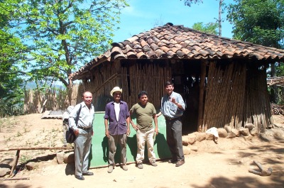
The schools have grown and prospered. There are 10 CASS teachers from the rural communities of Morazán, most studied at Alamo Colleges (nine of them attended the workshop at the Education Resource Center that we facilitated on Saturday – more later on that). All of these teachers have a remarkable shared community history of war, survival, and rebuilding. They are brave, resilient and, now, amazingly joyous people who are still working under difficult conditions by U.S. school standards – at least as far as the “material world.”
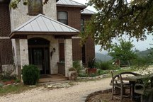
THEN (Elmer's first school in Morazán)
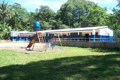
The same school today (and Elmer is an administrator of a program that trains teachers who do not have university degrees with workshops and web-based college courses so that they can become Licensiados.)
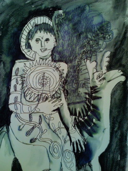
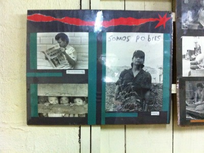
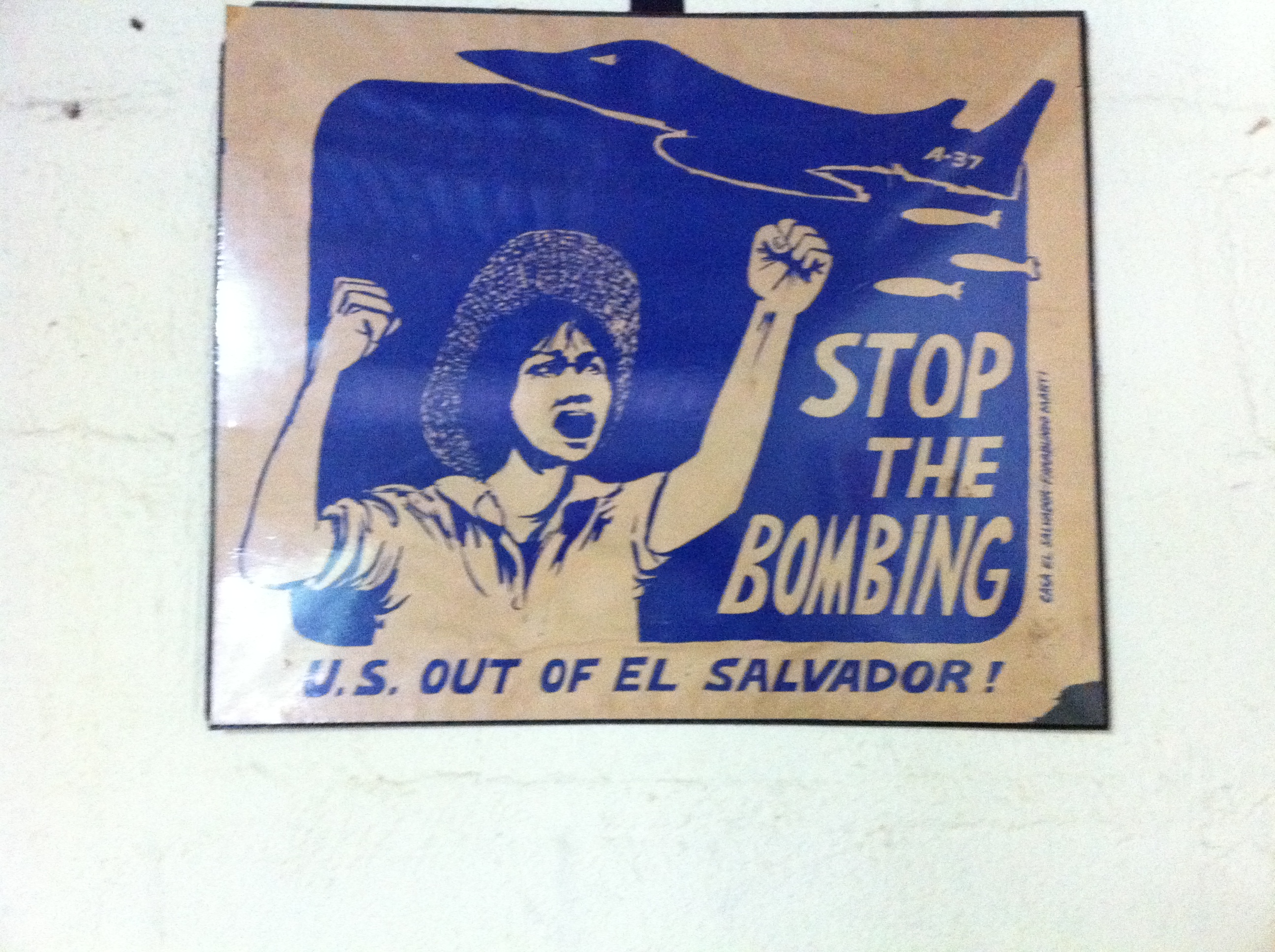
The museum is small and modest: a few rooms lined with photos and small glass cases of artifacts from the conflict – pictures of pre-war poverty of the region (no schools then, no democratic representation, intense prejudice against the indigenous people and widespread hunger and poverty) medial supplies, the backpack of a revolutionary hero, posters of support for the fighters, rifles and machine guns, parts of downed aircraft. All these signs of violence and courage set against a background of children’s paintings depicting the peace. The museum is larger, and Julia noted a new pride and cultural ownership by the indigenous Linca tour guide as he described the people who have lived in this region since people arrived.
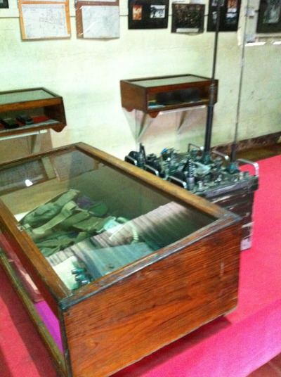
Another building shows a recreation of the radio station that was the voice of the people. Photos show women, children and elders operating the radio – equipment patched together from old transistor radios and other well-traveled electronics were used as receivers by the guerillas in the mountains. In the back of the museum, a bomb still remains in a crater, with other earthen holes that show the impact. Our guide explained that on one day during the conflict 20 government planes each dropped 4 bombs on Perquín – the intent was obvious, to drive these people into the earth. (An effort, by the way, funded by the U.S. During both the Reagan and Carter administrations – at the height of the war -- the U.S. was contributing about 1.5 million dollars a day to the El Salvador government.)
Despite the part of the U.S. in the tragic history and loss of the region I was welcomed and have been warmly affirmed as a friend by the teachers we worked with in San Antonio. And as a tourist there this week, I sensed no resentment or anti-American sentiments. The teachers who came to us during the earliest years of our work with CASS all shared the history of the region, and grew up in the Honduras refugee camps camps. Many of the personal stories that they used for hand-made books included images of helicopters overhead, families fleeing across the river border, children waking in the middle of the night to escape the violence. And their photos were of a town literally leveled to the ground.
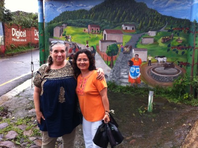
Now, after the Peace Accord was signed in 1992, Morazán is a welcoming place, busy with life and hoping for more tourism, (about 6,000 people a year visit the museum in Perquín) with a growing number of artisan crafts including indigo dyeing, paper and wood jewelry making, and sale of the distinctive coffee-colored clay pots from clay found only in this mountainous region, (More on the crafts later!) We had a wonderful meal at a little comedor, walked around the corner to buy coffee just out of the roaster – organic coffee – a new initiative in the area to rejuvenate the Salvadoran coffee industry, one devastated by global economy and the less-expensive coffee of Southeastern Asia.
Much money flows into El Salvador from the U.S. – formally in US aid including programs like this scholarship program-- and informally, through the money sent back to families at home from the emigrant Salvadoreanos in the U.S. But that’s another story!
Coming tomorrow, more about the crafts and art of El Salvador.


 Susie Monday