Art with CAYA -- Youth Ambassadors
 Sunday, January 30, 2011 at 01:27PM
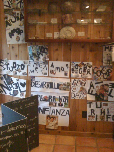
The week flew by with work at Bamberger Ranch and then at Southwest School of Art with the CAYA group, Texas host kids and families and the year-long residency group of SEED teachers. On this post, we just wanted to share some of the graphic and visual forms we worked on -- you can see more photos of the various aspects of the program, and the kids at work, on the Posterous SEED blog, if you're interested.
This is what I love about these graphic forms, and why I think they work as collaborative art projects:
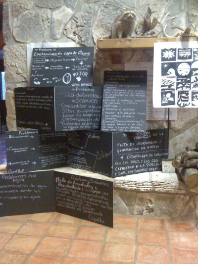
First, limit the palette in use to some degree -- kraft paper brown, black, white and red construction paper were the choices here (We loosen up on these color restrictions as the day goes on, figuring that the repetition will hold the general design together).
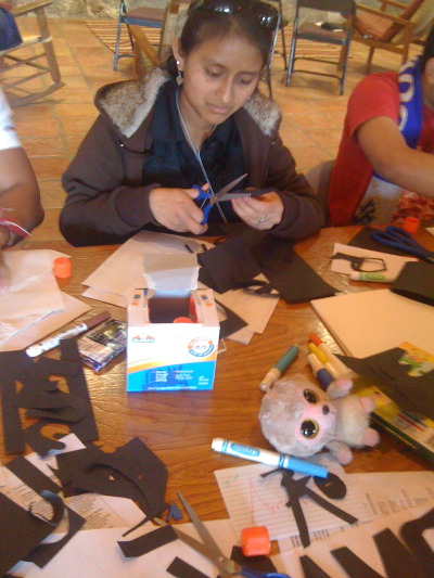
In the projects, we emphasize cutting over drawing or sketching. First, its less intimidating for kids who don't think they are good artists. Secondly, it keeps things simple and strong and bold. Black cutout letters and shapes are the bones for any little fussy stuff on top!
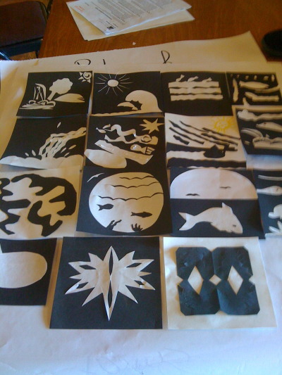
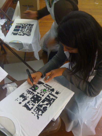
The t-shirts start with cutout "logos' for air, earth and water. Each kid makes a logo. I gang them together reduce each to a grid that will fit on a thermofax and the kids get to print their own shirts. Then, with colored fabric markers, each one can individualize and personalize his or her design. Again, the black ink on white shirt holds the whole design together.
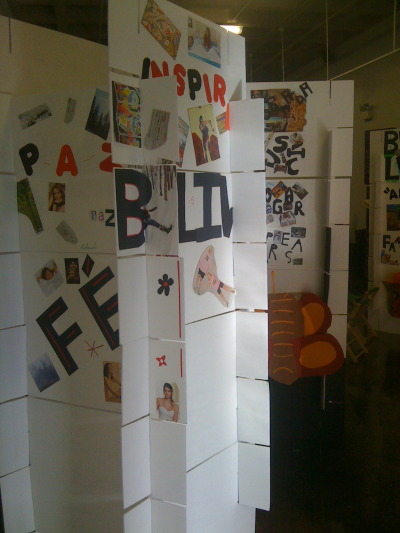
The "dream towers" included collage work (each person cutout a large word that described a personal dream, then collaged it with magazine pictures), a few notan designs, etc. Again, the color palette holds it together. I used the model of the Eames "house of cards" as patterns for the large foam board cards. These notch together with slits and make relatively stable and sturdy set/exhibit pieces that can be easily stored, recycled with new images with a new group, and infinitely rearranged. Since our final exhibit and presentation was in a gallery where we could not attach anything to the walls, these towers provided display space for work -- and they could be quickly assembled and disassembled and moved easily in the van or even a passenger car backseat!
The black foam board cards were just taped into triangles (for stability) and stacked on top of each other. Kid wrote their recipes and remedies and cures for issues facing their world on these with chalk -- again, the boards can be wiped clean and reused. The blackboard form was fun, gave shape to the thinking and message, and was un-intimidating since if one made a mistake you could erase and do it again. And I love the black and white with the other forms.
The mask forms are simple paper bag masks using limited colors and mostly cut out shapes and forms. The kids (each in their group of either water, earth or air) chose a creature or element to personify as a mask and to "speak" for -- their assignment was to be a voice for those without words -- the animals, plants and elements of nature that depend upon survival with our solutions for the difficult problems facing the environment and our stewardship of the world, our partnership with the rest of the world. We used recycled packing materials from our lunches and other meals in these, as well.
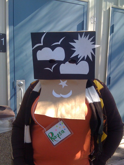
After years (and years) of doing collaborative (and quickly produced) art forms with kids and adults with all kinds of content, I do have my bag of tricks and approaches that help with visual strength and form, but still give everyone the sense of personal contribution and expression. I think that providing a few "rules" in terms of setting a strong format, limiting materials, and structuring the work experience all add up in the end.
 Bamberger Ranch,
  CASS,
CASS,  CAYA,
CAYA,  SEED,
SEED,  graphic design,
  workshops in
  Creativity and other big ideas,
  Exhibits,
  Workshops
